FO/RE
<ROLE>
UI/UX Designer
Full Stack Developer
<TIMELINE>
From August 2025
To April 2026
<TEAM>
Solo project
<TOOLS>
Figma, XCode,
ShortCuts, Claude Code
Fore

< TL;DR >

Overview

Transition into and out of work effortlessly with a simple tap.

While most productivity tools focus on managing the environment by adding more features like timers, blockers, and notification settings, FO/RE takes a different approach: shifting the focus. This is specifically designed for remote workers who lack the environmental cues that signal the boundary between work and personal time.

This project delivers an intuitive experience with a frictionless user flow, helping remote workers seamlessly switch their mindset. It is designed to guide them smoothly into and out of their workday.

It is built with Xcode and Apple Shortcuts, and has been tested in real environments through two academic semesters.
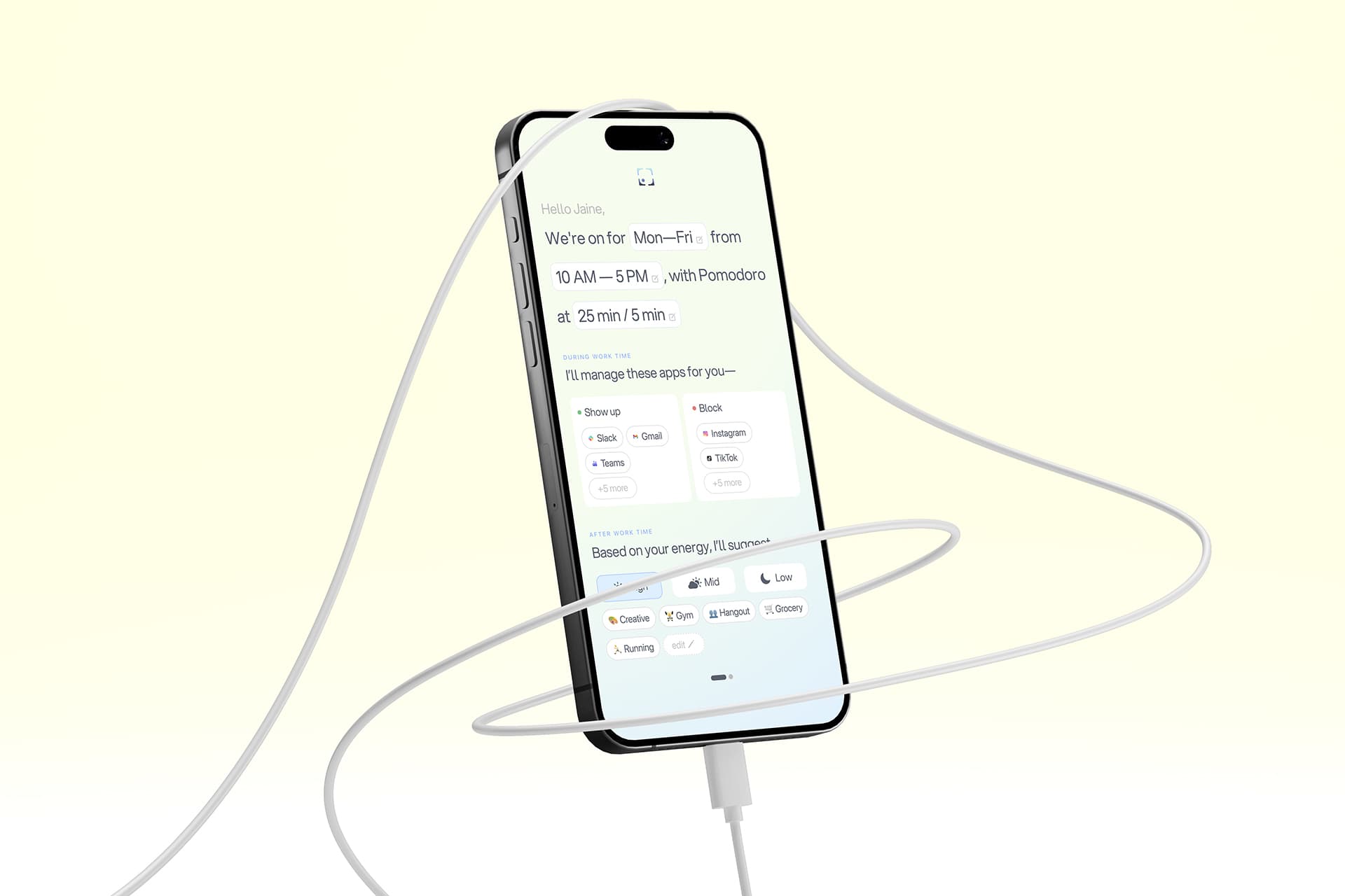
Final Solution

< PROBLEM >

Problem

There is no enough ways to keep engaged to the work when people work at home.


These days, remote work participation continues to grow. Around 50–55% of work models are hybrid, while fully remote work models account for 15–27%. However, there are still problems: remote workers struggle to separate their work and personal life, often checking email outside official hours or working on weekends. (Gallup; SearchLab.)


69%

of remote workers report burnout from blurred work boundaries.

72%

of remote/hybrid workers use their bedroom or living room for work.


These statistics show that the main point is that it is hard to separate work and personal space in their home offices. This means physical spaces; something that cannot be fixed easily. Then, how can we improve physical space through a digital solution?

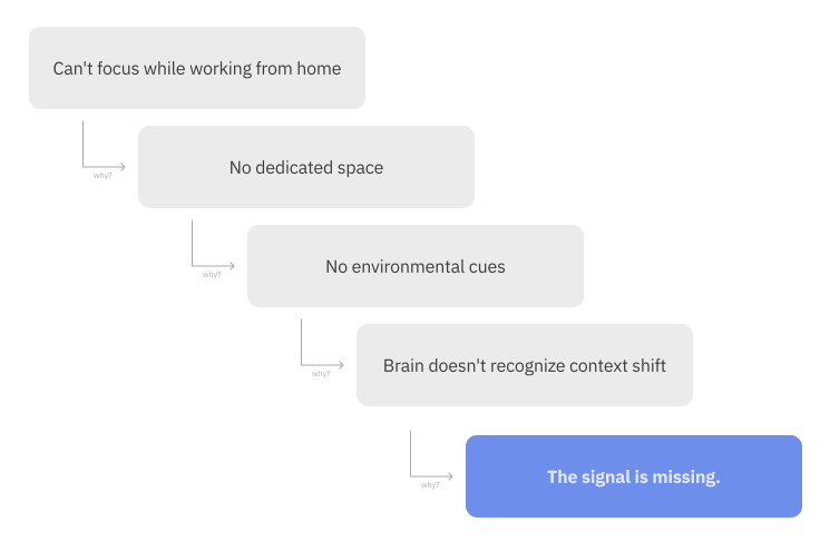
5 Whys

The 5 Whys helped figure out why physical spaces directly affect focus while working from home. It showed that it is important to have clear environmental triggers and properly separate spaces for better focus.


A 5 Whys analysis confirmed this:


5 Whys

Market Gap

The problem isn't a lack of tools;
It's a missing signal.


Existing tools try to fill this gap with more features. However, managing all those tools becomes its own cognitive load, leading to user frustration. It highlighted the importance of an intuitive experience.

Market Gap

Opportunity

The opportunity wasn't to build another productivity app. It was to design the signal itself.

HOW MIGHT WE...

incorporate physical cues to help users switch seamlessly between work and personal modes in digital spaces for better work–life balance?

< Research >

Pain Point

Through user interviews and surveys, I found 4 main pain points of the users:


Star Icon

Work mode bleeding into personal space

Star Icon

Constant minor interruptions

Star Icon

Unstructured and unrefreshing breaks

Star Icon

Lack of a definitive end-of-work signal

Hypothesis

I came in with four hypotheses. One of them was completely wrong — and that wrong turn shaped everything.

Over one year, I conducted research across discovery, synthesis, and validation phases — surveys, interviews, competitive analysis, Reddit analysis, co-creation sessions, and scenario walkthroughs.

Here's what I expected, and where the research pushed back.

HYPOTHESIS 01

Feature-rich tools help users stay organized. 

Invalidated

Participants consistently found feature-heavy tools overwhelming. More to manage meant more cognitive load — the opposite of the goal.

HYPOTHESIS 02

Proper break time matters more than I assumed.

Validated

Every participant raised breaks unprompted - not as a nice-to-have, but as a source of genuine daily frustration.

HYPOTHESIS 03

A physical gesture carries more weight than a digital button.

Validated

Initial concern: would tapping a card feel gimmicky? All five co-creation participants said it would actually help them switch mindsets.

HYPOTHESIS 04

Users want intentionality after work, not just during it.

Validated

4 of 5 participants ended their day doomscrolling. 3 of 4 wanted something more intentional-but had no cue to make the shift.

Key insights

Across all four hypotheses, one pattern kept emerging:

People don't need more features. They need a clearer signal.

The most effective transition isn't a checklist or a timer — it's a ritual. Something small, repeatable, and physical enough to register as a meaningful boundary.

Design Principles

01

Enable intentional transitions

Support deliberate switching between work and personal modes - in both directions. Entering focus and exiting it are equally important.

02

Keep interactions minimal

One physical action triggers the full environment change. No extra steps, no ongoing management. The ritual should be effortless.

03

Use physical cues as behavioral anchors

The NFC tap isn't just a shortcut. It's a signal the brain can learn to associate with context - the same way a commute once was.

< DEVELOPMENT >

Concept Exploration

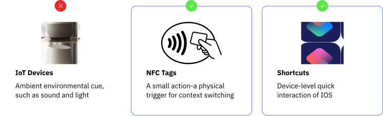
Three directions were evaluated:

Concept Exploration

The final concept combines NFC cards with Apple Shortcuts. Neither works as well alone — together, they create a seamless physical-to-digital ritual.

How it works

From a one-time setup to a single daily tap: what the user does, and what runs behind it.

SWIPE TO SEE THE FULL FLOW →

Gemini API icon

The Gemini API suggests work-app and blocked-app presets based on the user’s job.

Design System

I translated the Figma variables into one SwiftUI file: colour, type, spacing and radius as tokens, with core components built on top. Every screen pulls from the same source.

01 · Colour tokens

Figma variables become named Swift constants.

FIGMA · VARIABLES

Neutral / Dark

  • #0F1114
  • #1E2026
  • #2A2D35
  • #454A57

Brand / Blue

  • #D7ECFF
  • #A9C4FF
  • #7DA7FF
  • #5C84D6
SWIFTUI · ForeTheme.swift
extension Color {
    // Text
    static let foreTextDark   = Color(hex: "0F1114") // Neutral/Dark 1
    static let foreText       = Color(hex: "454A57") // Neutral/Dark 4

    // Brand
    static let foreBlueLight  = Color(hex: "D7ECFF") // Brand/Blue 1
    static let foreBlueAccent = Color(hex: "7DA7FF") // Brand/Blue 3
}
02 · Typography

Semantic roles instead of raw sizes, with Figma spacing converted to points.

FIGMA · TEXT STYLE

Typography

Font
Aspekta · Semibold 600
Size
16px
Line height
120%
Letter spacing
−1%
SWIFTUI · ForeFont
struct ForeFont {
    static func semibold(_ size: CGFloat) -> Font {
        .custom("Aspekta-600", size: size)
    }

    // Semantic roles
    static func title(_ size: CGFloat) -> Font { semibold(size) }
    static func button() -> Font { semibold(16) }
}

Text(title)
    .font(ForeFont.button())
    .kerning(-0.16)   // −1% × 16px

Figma sets letter spacing in %, SwiftUI in points: −1% × 16px = −0.16pt

03 · Components

Built only from tokens, so a change in one place updates every screen.

FIGMA · BUTTON
FULL WIDTH · H-PADDING 24
Continue
PADDING 15RADIUS 25STROKE 1 · #B3B3B3
SWIFTUI · ForeContinueButton
Text(title)
    .font(ForeFont.button())
    .foregroundColor(.foreTextDark)
    .padding(.vertical, 15)
    .background(
        RoundedRectangle(cornerRadius: ForeRadius.button)
            .fill(Color.foreWhite)
            .overlay(
                RoundedRectangle(cornerRadius: ForeRadius.button)
                    .stroke(Color.foreBorder, lineWidth: 1)
            )
    )
    .padding(.horizontal, ForeSpacing.xl)

No raw hex values. Every value comes from a token.

< SOLUTION >

solution

Xcode

I built FO/RE in Xcode — a fully functional iOS app, not a prototype.

1

Mode Switching

One tap transitions the full digital environment between work and personal contexts.

2

Focus Blocking

During Work mode, distracting apps and notifications are automatically suppressed. Focus is the default state, not something to fight for.

3

Intentional rest

After Work mode surfaces energy-based activity suggestions — High, Mid, or Low — so rest is designed, not just the absence of work.

1

NFC card as a ritual

A physical NFC card triggers the transition between Work and Personal modes. The point isn't automation, it's the small, intentional gesture itself.

iPhone Mockup
iPhone Mockup

2

Personalized app recommendations

During onboarding, users input their job role. The app uses this to recommend which apps to open during Work mode, reducing the cognitive load of manual setup supported by AI.

3

Distraction blocking

Users select which apps to block during Work mode. Once confirmed, blocking activates automatically every time Work mode is triggered — no repeat configuration needed.

iPhone Mockup
iPhone Mockup
iPhone Mockup

4

Intentional rest with Pomodoro

Three focus rhythm presets — Deep Focus, Standard, and Light Pace — provide structured work and break intervals. Rest is built into the work session, not an afterthought.

5

After Work Suggestions

After the workday ends, the app recommends activities based on the user's energy level. Planned next step: link these suggestions directly to Apple Reminders via Shortcuts.

iPhone Mockup
iPhone Mockup

6

Shortcuts export

At the end of onboarding, a step-by-step guide walks users through setting up their Apple Shortcuts configuration — making a technically complex setup feel straightforward.

7

Home Screen

All active settings are visible and editable from a single screen — schedule, Pomodoro rhythm, managed apps, and after-work suggestions. Everything in one place, nothing buried.

iPhone Mockup

< REFLECTION >

Takeaways & Reflection

Reframing the problem

I started this project by asking what was broken in remote work. However, after research I asked a different question: which moment do people need help with? The answer was the transition, not the work itself.

A ritual, not an interface

The most important interaction in FO/RE doesn’t happen on a screen. I was designing a ritual, and the physical item mattered more than any button I drew.

Less is harder

My own research said fewer features were better, but it was hard to choose which features I should keep. I kept daily use to one tap and moved the rest to setup. Designing that flow was hardest part.

Future Opportunities

1

Android and Windows compatibility

The system currently assumes an Apple ecosystem, which limits who it can reach.

2

A portable trigger for workers without a fixed desk

The card works best in one place, so people who move between spaces need a different cue.

3

Extend to team-level context switching

Hybrid teams have the same boundary problem at a collective level: no shared signal for when collaboration begins and when focused work does.